Trybes of
Brand Identity
Design & Layout
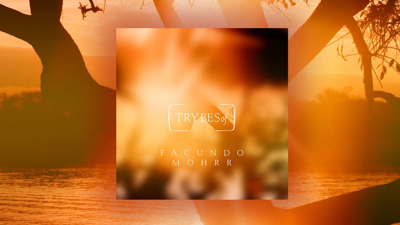
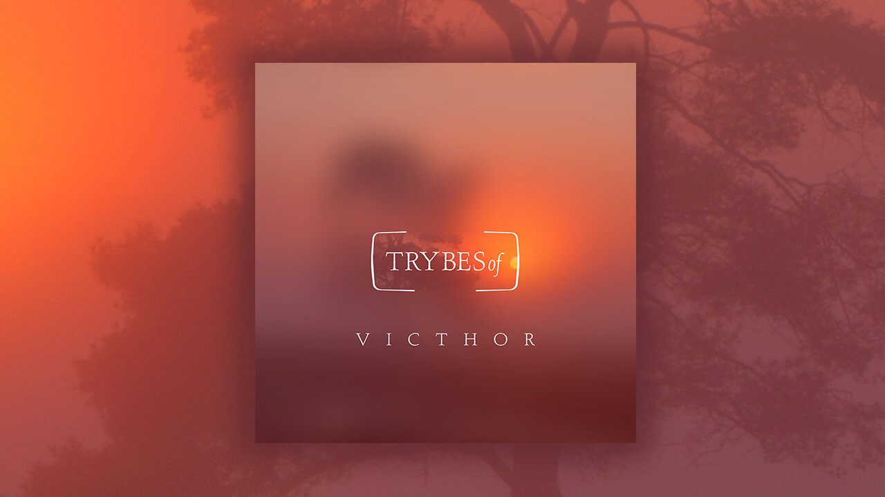
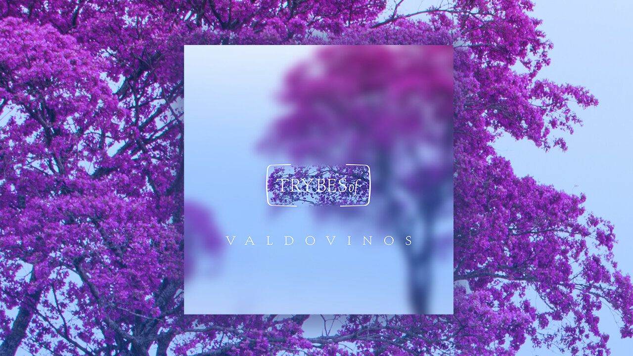
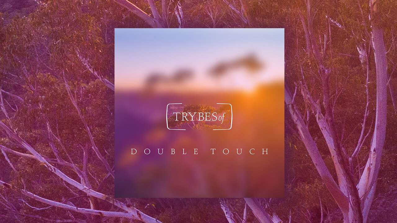
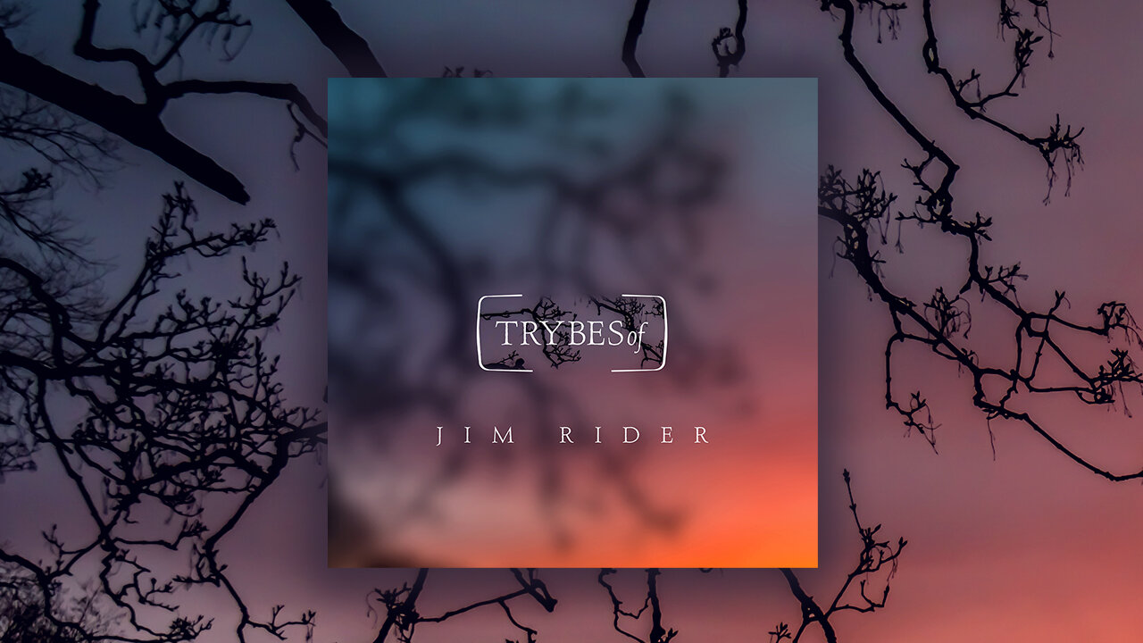
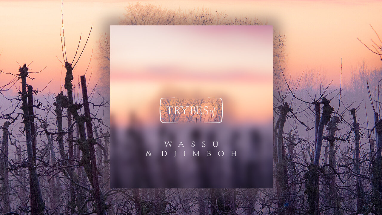
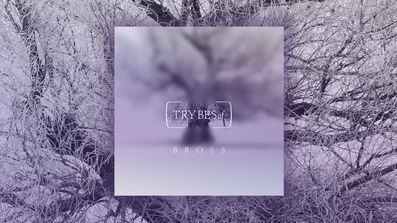
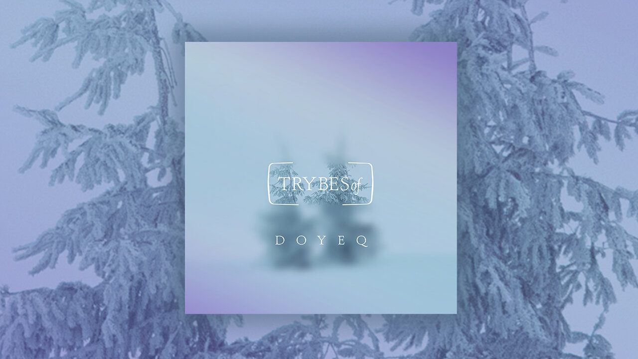
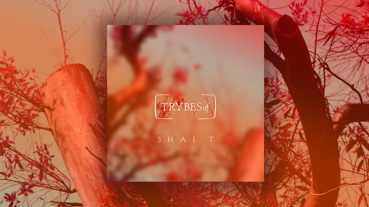
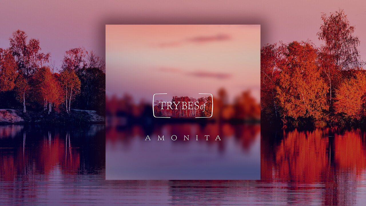
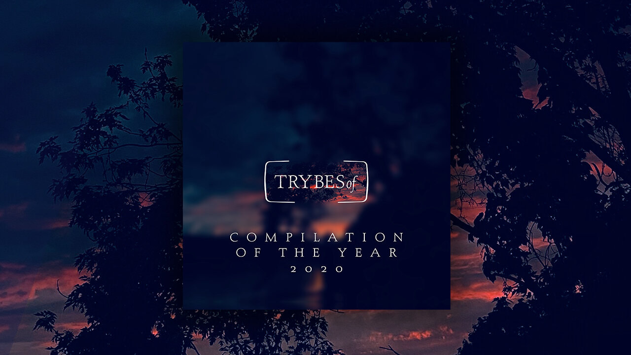
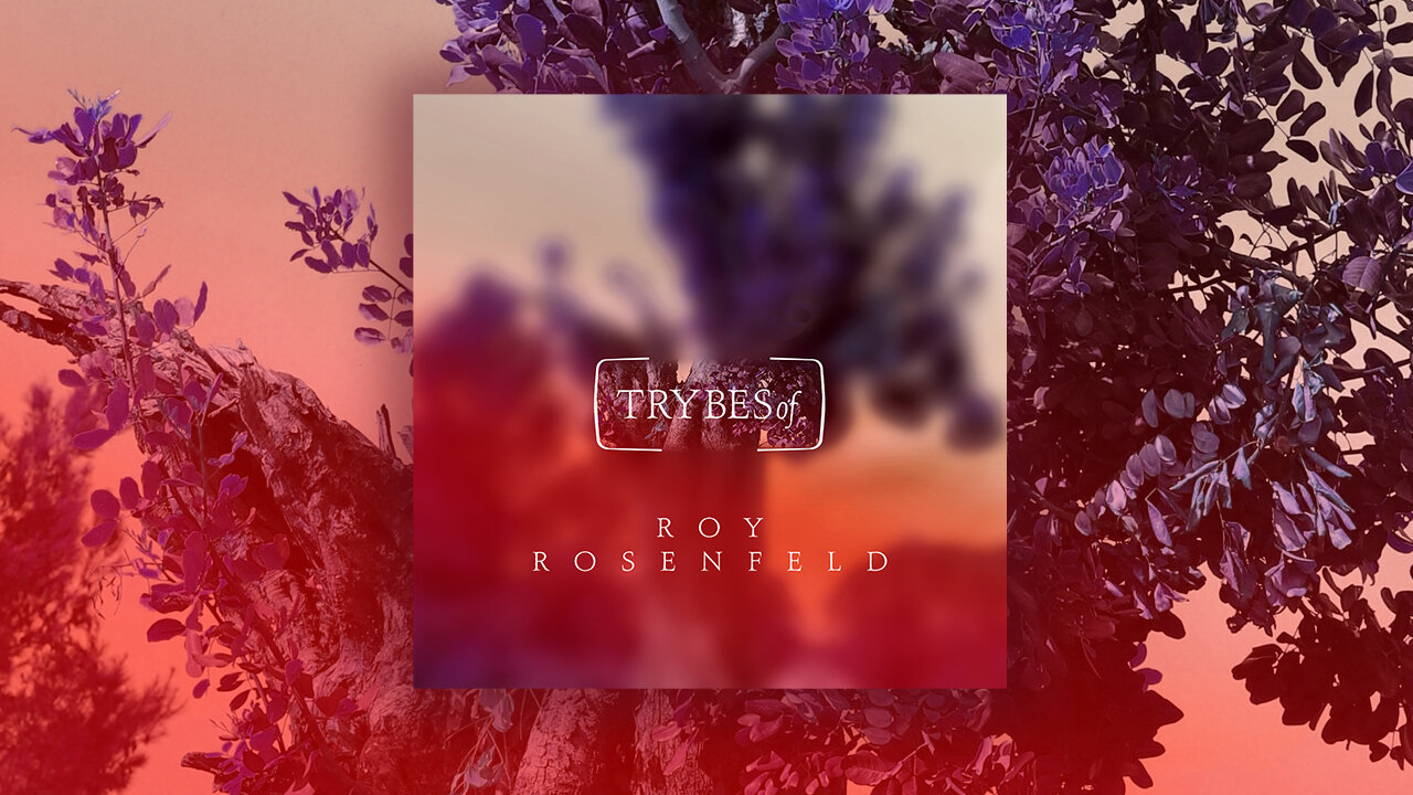
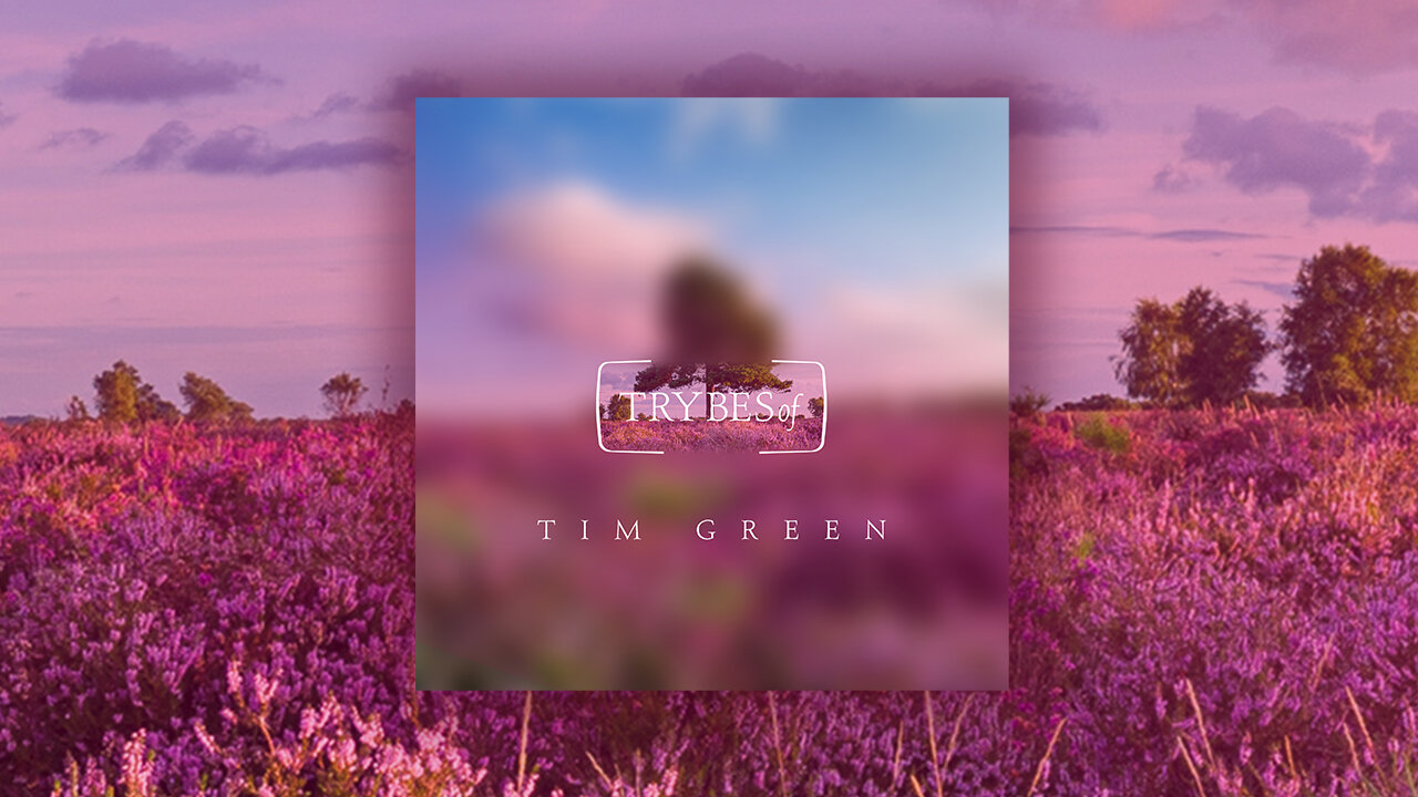
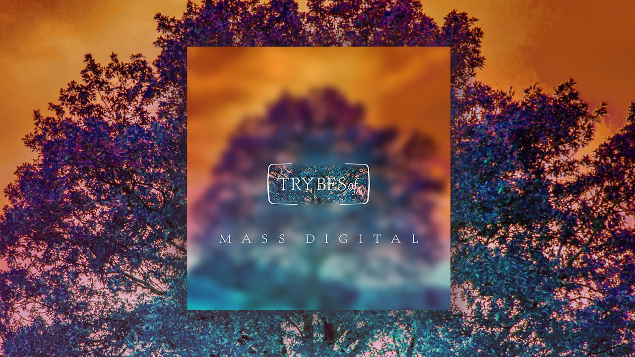
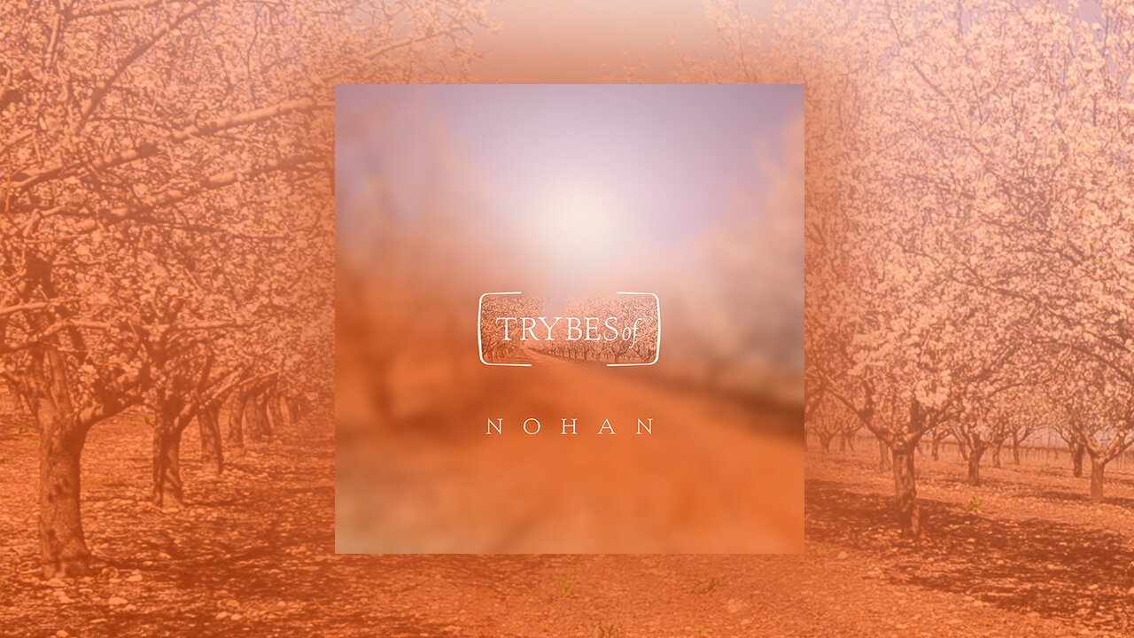
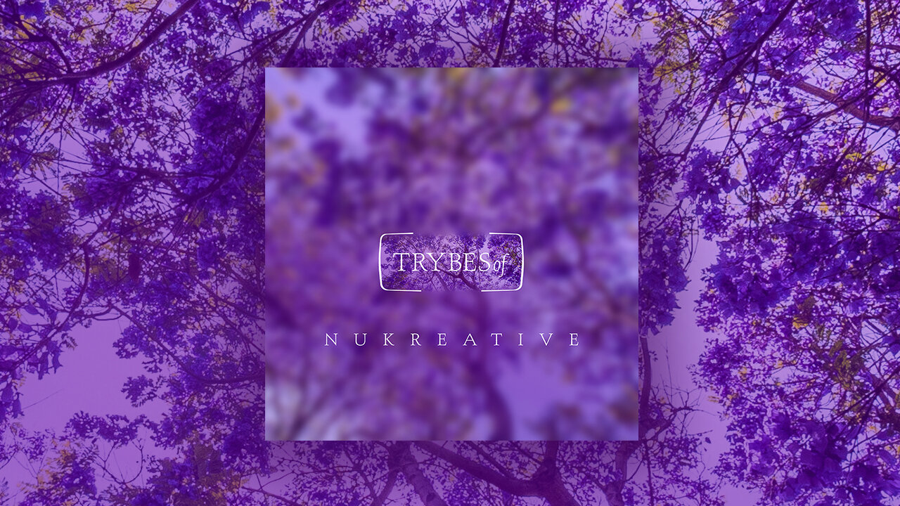
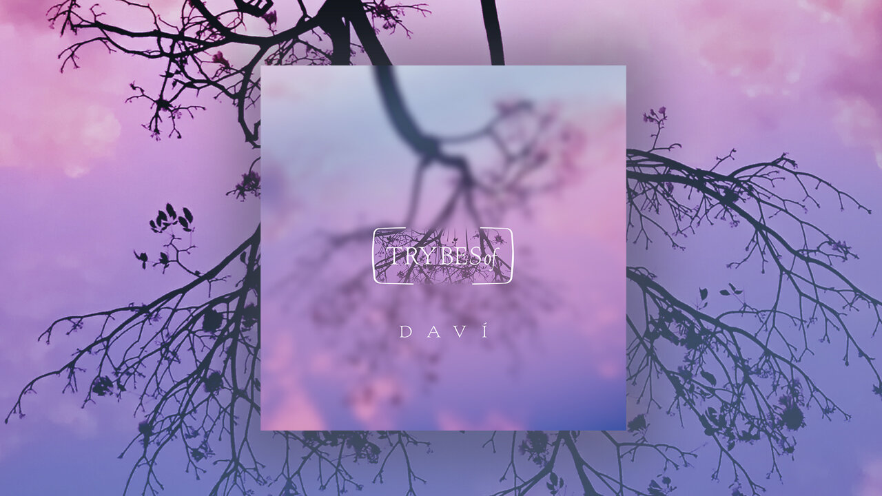
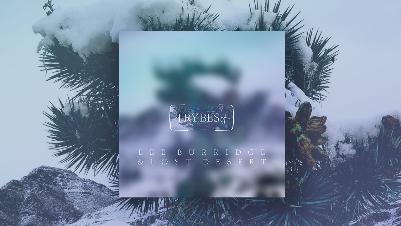
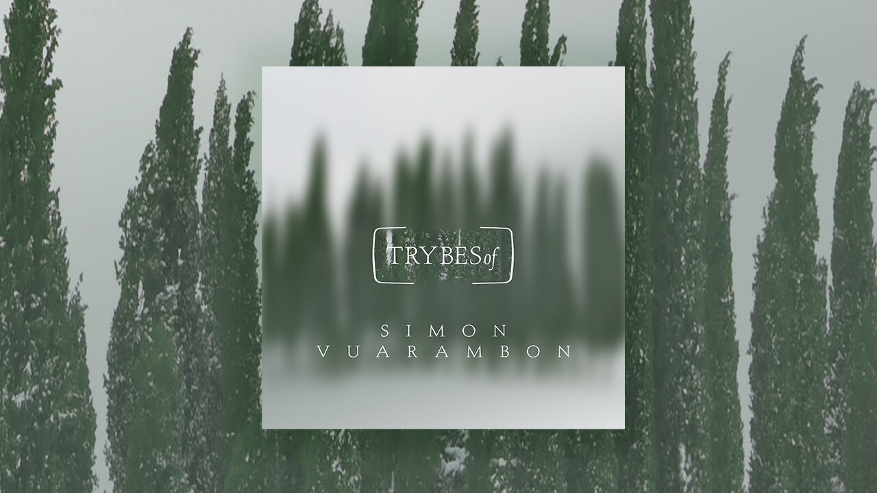
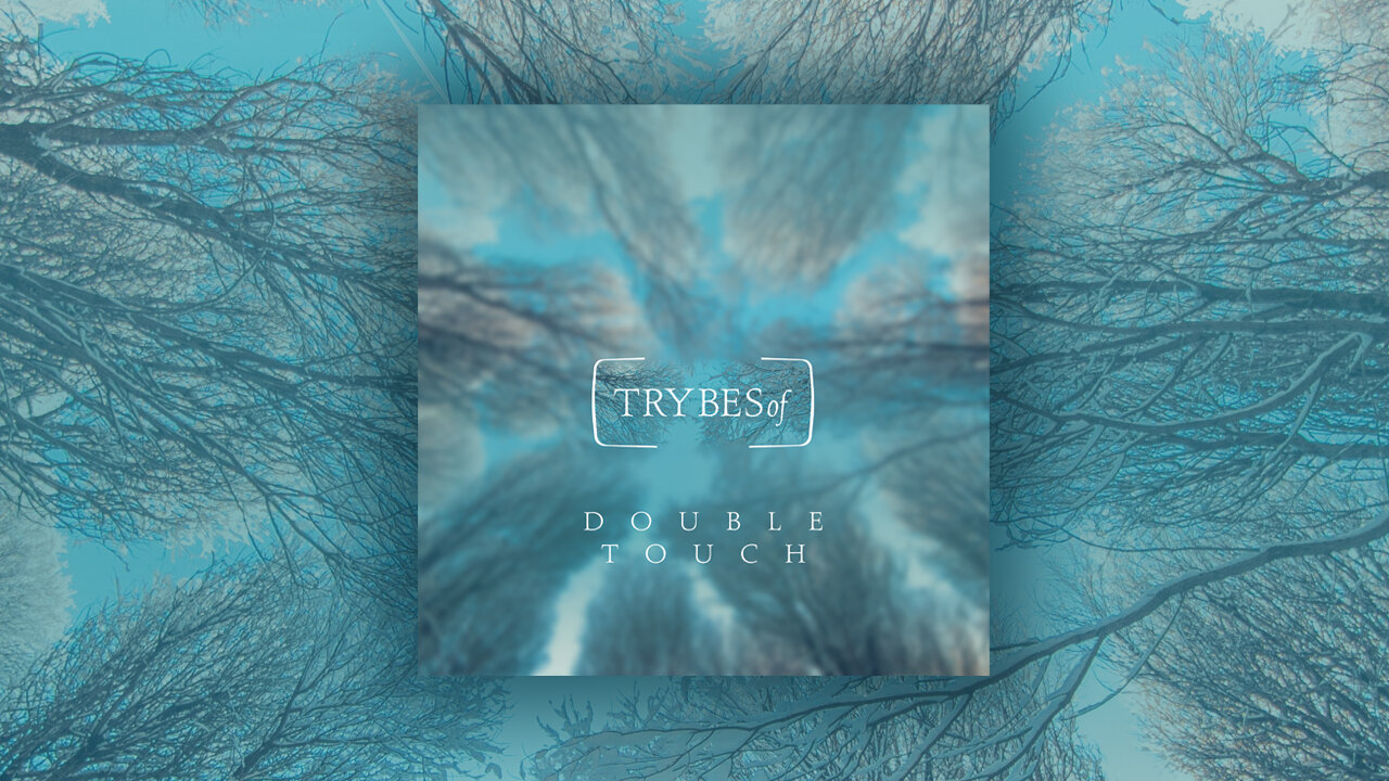
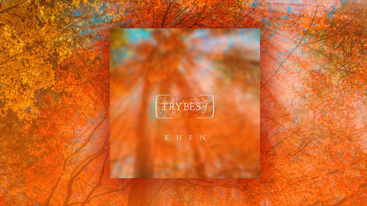
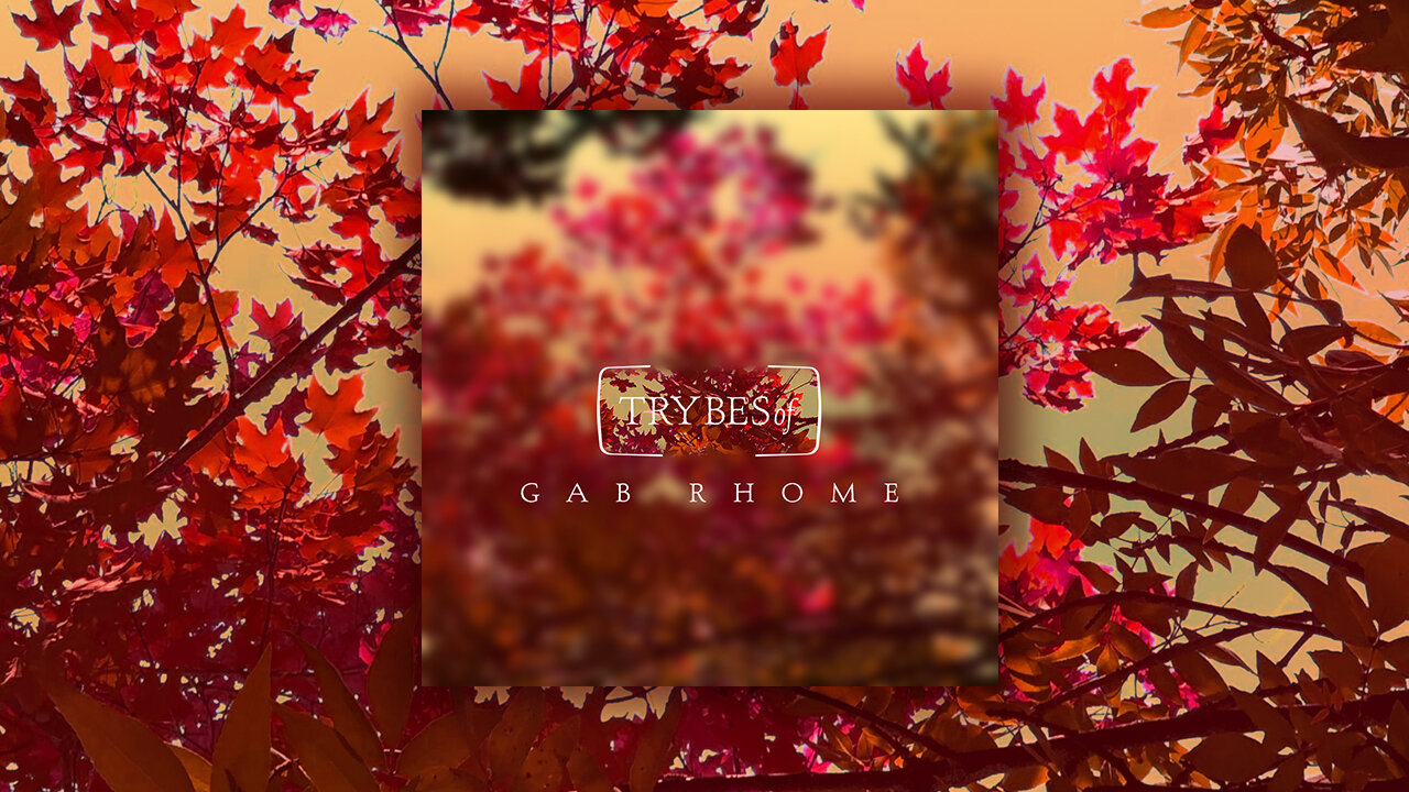
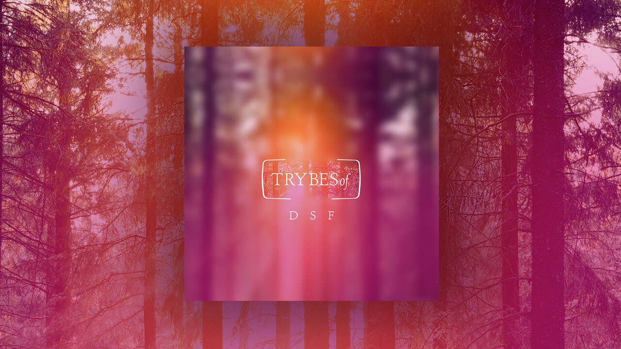
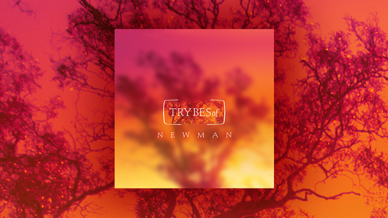
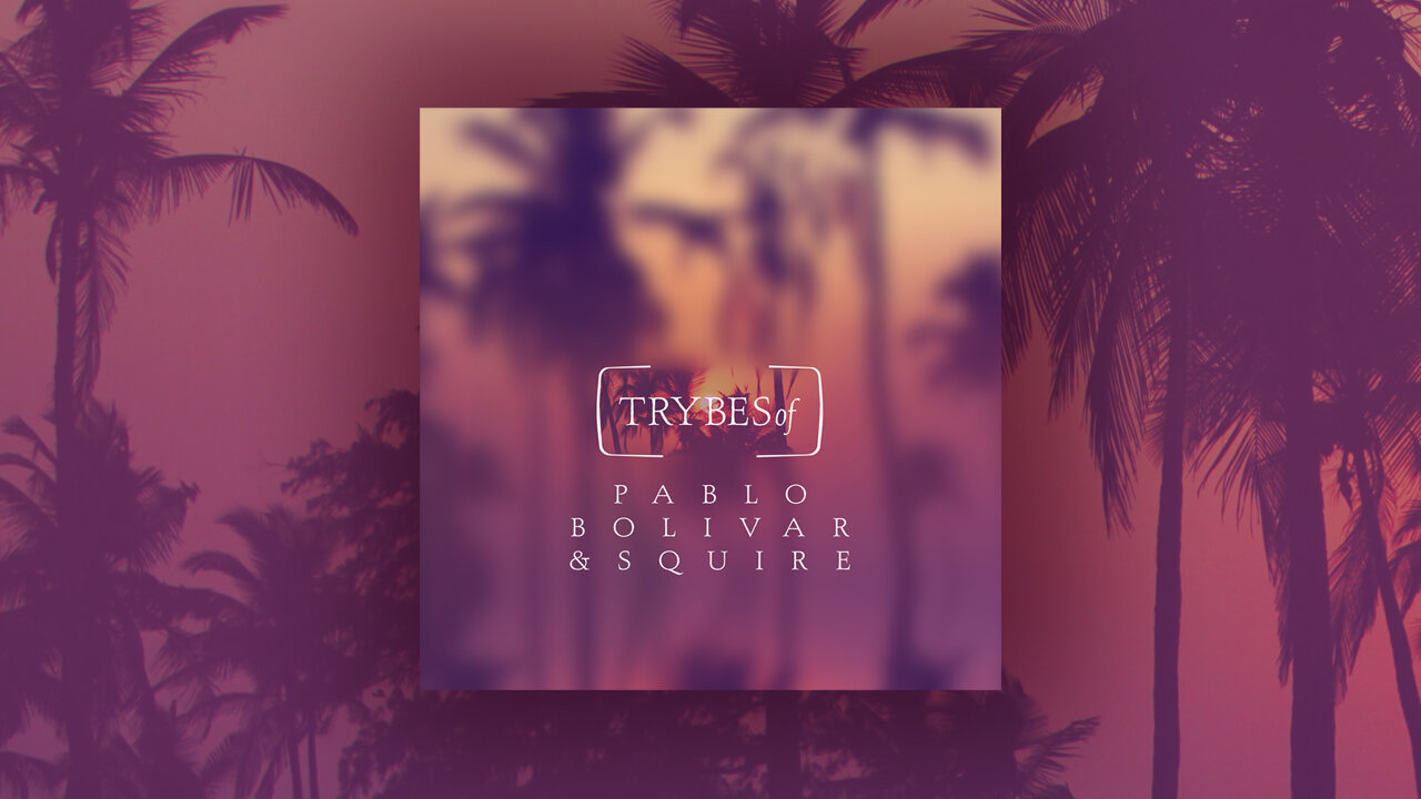
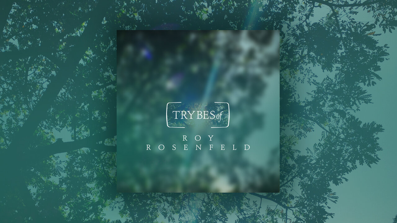
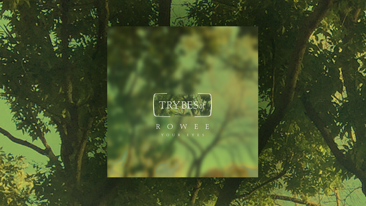
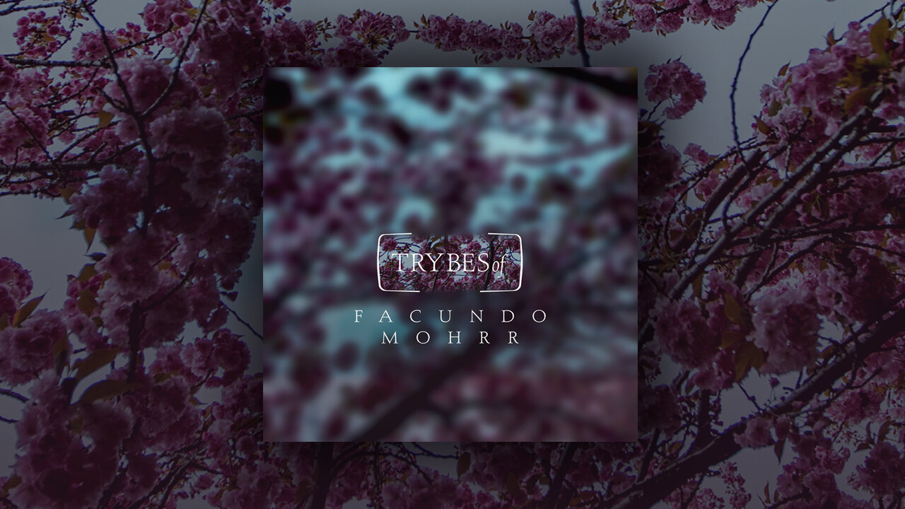
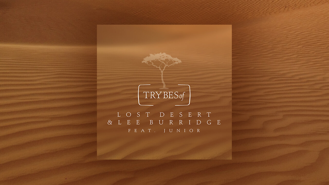
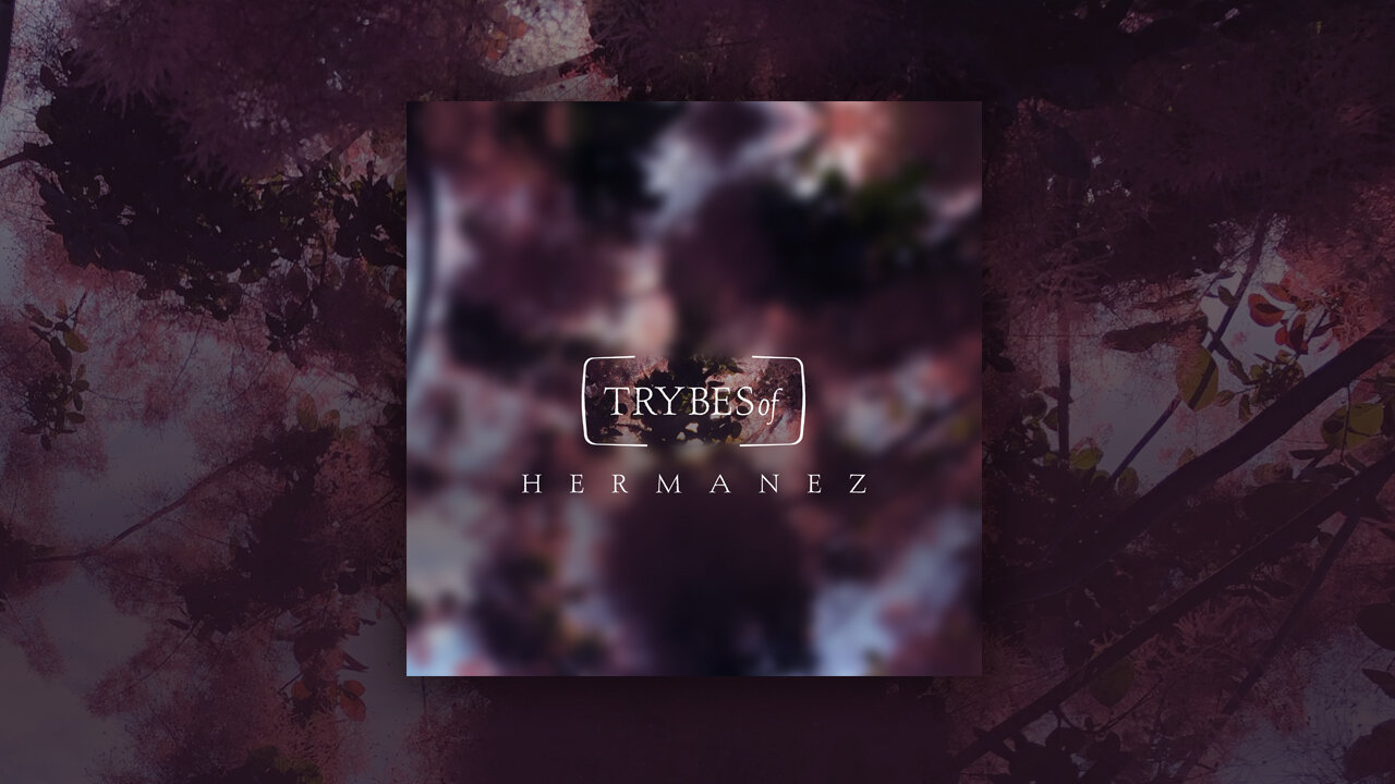
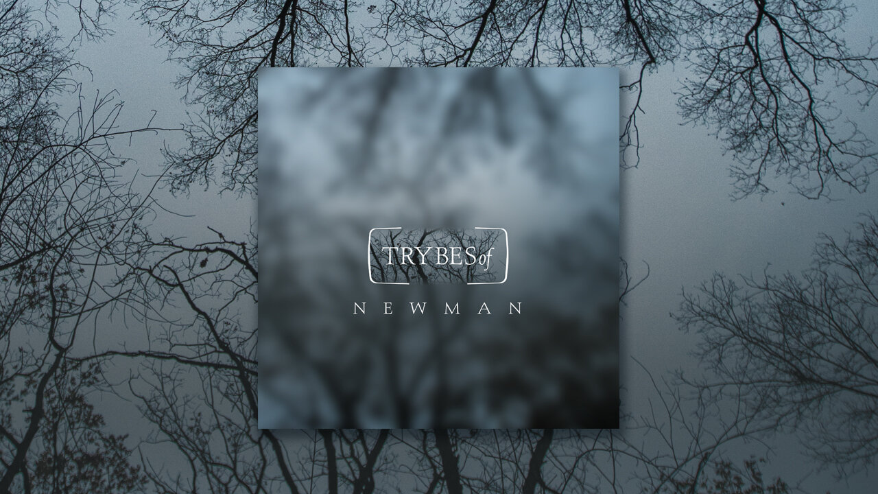
Lee Burridge came to me with a little seed in his head and asked me to design a project logo for ‘Trybes of’. Originally we were thinking of a tree in the logo. But after much play, it became clear that the trees would live in the imagery. And the logo mark became a bit of a container that pushed the “tribe” concept even further.
Imagine a tree as a community, and within that community, there are sub-communities. The mark is sectioning one sub-community - but still being open on both ends for it to flow through. We decided to use the seasons to push the imagery along. Abstracting the tree a bit on the cover art, but revealing the details of the tree on the social banners. The way I designed this vibe lends itself to endless possibilities. Well, maybe not infinite. But the concept can continue to grow and evolve with ease. I am excited to see this brand developer.