GRIT NEW YORK
Brand Identity
Swag Development
This was a project for my homegirl Anne. She needed a badass name for her new business - One that had some range and toughness like her. We were spitballing names, and I sad Grit New York. We both were like f$ck yeah - that is money. And so I got to work — my idea was to take a classic font pairing and make it street. So that is what I did - using Bodoni and Futura.
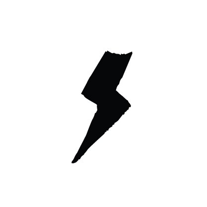
After five years in business, we did a little swag. I used the lyric “I got 5 on it” as inspiration. When playing in illustrator, I flipped the 5 upsides down, and it looked like a cool G. $hit like that always puts a smile on my face.


